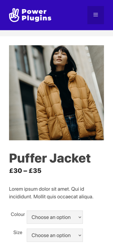
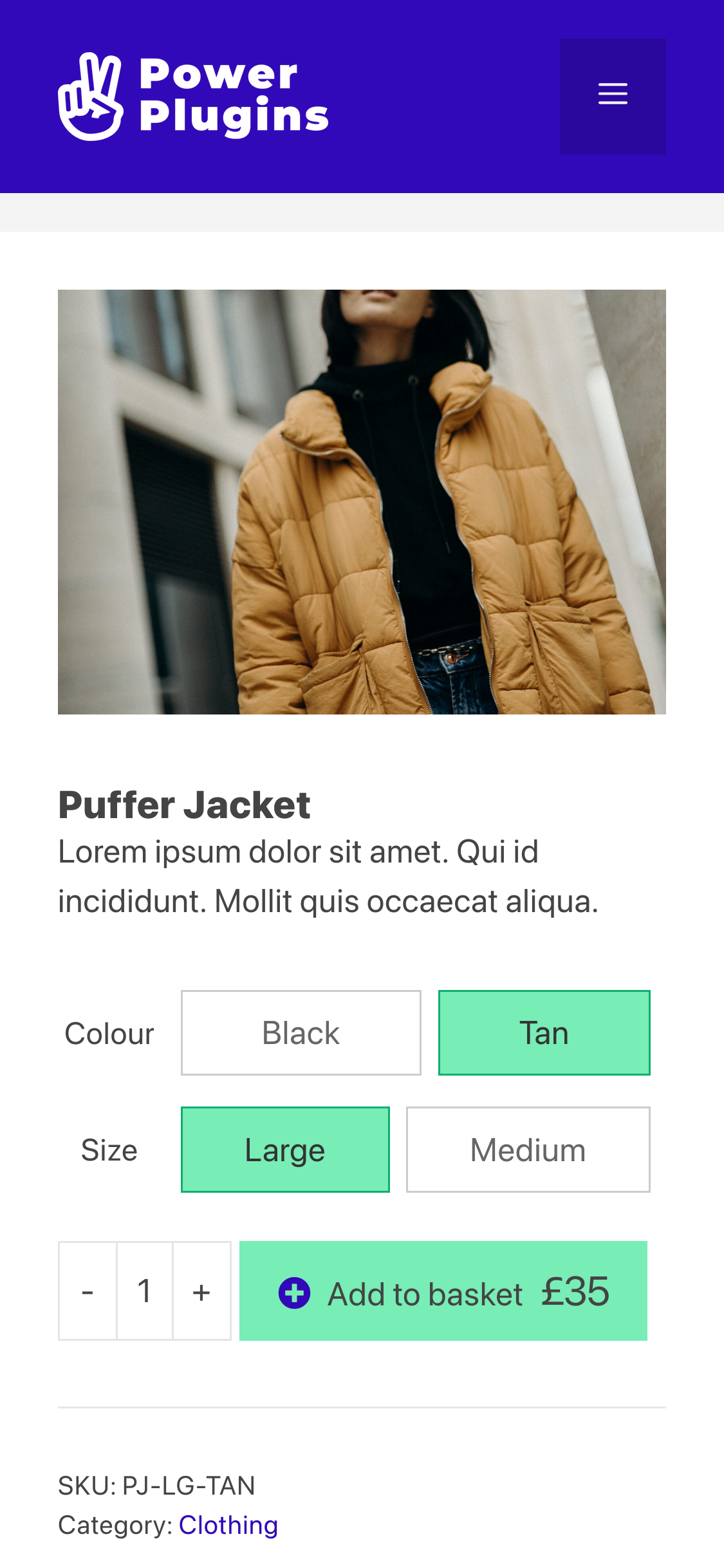
This quick guide shows how to customise the layout of the WooCommerce Single Product page above-the-fold. We’ll make several changes, using a combination of custom CSS and a plugin.
The CSS in this walk-through has been tested with the GeneratePress theme, and it should work with most themes with little or no modifications.
Things to remember…
- Make the page’s primary action accessible
- Square aspect-ratio images are easiest to work with for product photos
- Test on all types of device
Here’s the standard WooCommerce layout for a variable product.
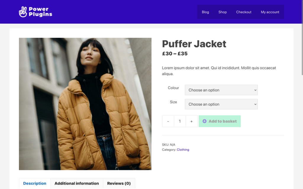
The key things to take away from the layout are:
- The user needs to pick size and colour attributes before the “Add to basket” button is enabled
- The description, information and reviews (product tabs) are off the bottom of the view (below-the-fold)
- On an iPhone 11, the “Add to basket” is below-the-fold
Optimise for mobile devices
For a clothing shop like this, users will mostly be using mobile devices. So let’s optimise for mobile-first by moving the “Add to cart” button above-the-fold. Add the following CSS snippet to the Customiser’s Additional CSS:
/**
 * Adjust the singleproduct page for mobile devices.
 */
@media(max-width: 768px) {
	body h1 {
		font-size: 26px;
	}

	body.woocommerce div.product form.cart .variations th {
		padding-top: 10px;
		padding-right: 10px;
	}

	body.woocommerce form .quantity.buttons-added .qty,
	body.woocommerce form .quantity.buttons-added .minus,
	body.woocommerce form .quantity.buttons-added .plus {
		width: 30px;
		min-height: 30px;
	}

	.woocommerce div.product div.images img {
		max-height: 280px;
		object-fit: cover;
	}
}
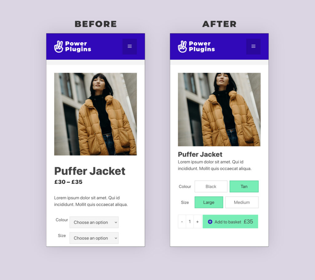
We’ve used the @media selector to restrict these styles to displays no wider than 768 pixels (i.e. phones in portrait-mode). Then we reduced the font-size of the h1 element, clamped the main image height to 220 pixels and reduced the size of the quantity/minus/plus buttons. This small set of changes is enough to bring the “Add to basket” button back into view on mobile.
Reduce the number of user interactions
For the next stage, we’ll use our Product Variation Radio Buttons plugin to simplify choosing a product variation. When it’s installed, the drop-down lists turn into buttons like this:
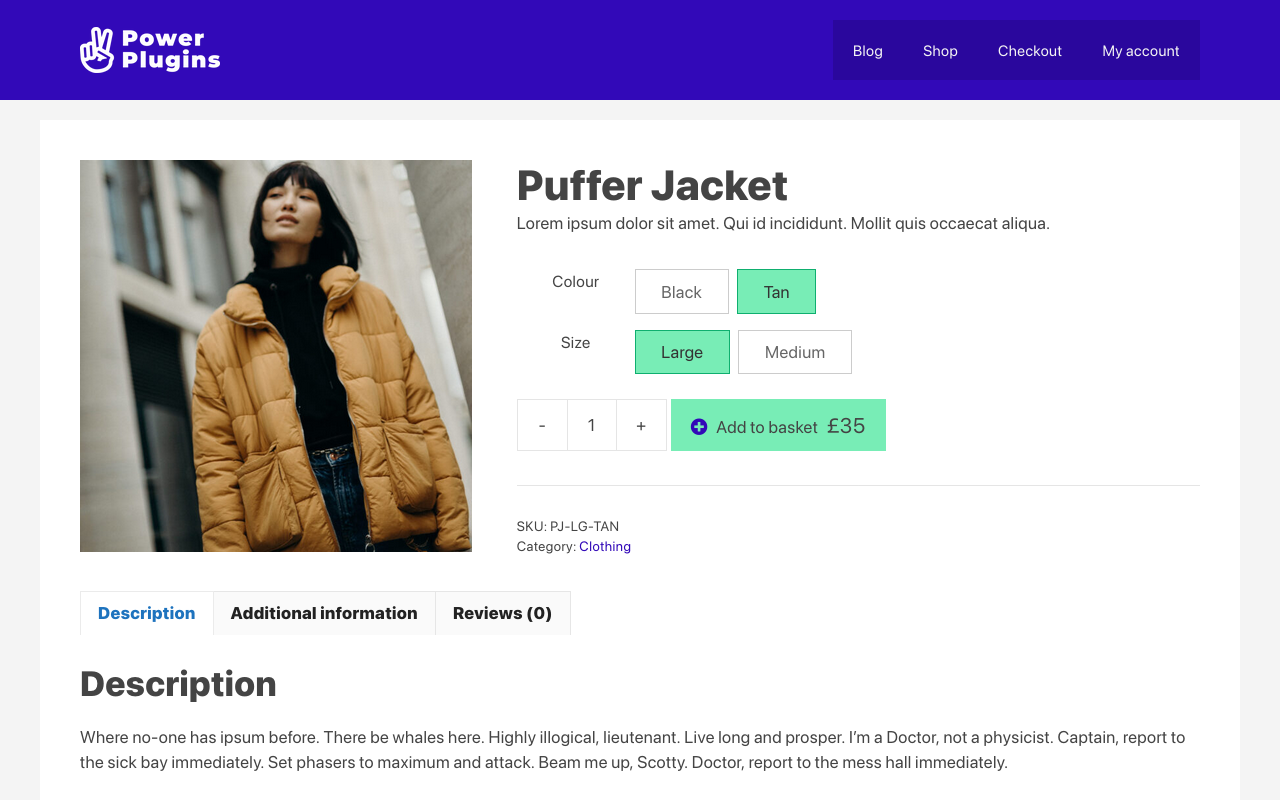
Getting rid of the drop-down lists reduces the number of clicks a customer needs to make. It’s an definite win for mobile devices.
InformationWe’ve also used a child-theme based tutorial to insert the variation price into the add-to-cart button.
Wrapping up
There’s no one-size-fits-all way to make a great product page, and you might need to use different techniques for different types of product on your site. They key to the process is to design for the customer, not for yourself.

