We’ll cover 5 simple things you can do to improve the WooCommerce checkout for your customers. All we need to do is identify the opportunities, create some simple CSS and configure a couple of lightweight plugins.
We’re going to follow the “Keep It Simple, Stupid (KISS)” approach to remove unnecessary elements and reduce on-screen clutter. The aim is to reduce the number of “roadblocks” between the customer landing on the checkout page, and being able to press the “Place Order” button.
Start by analysing the basic checkout page
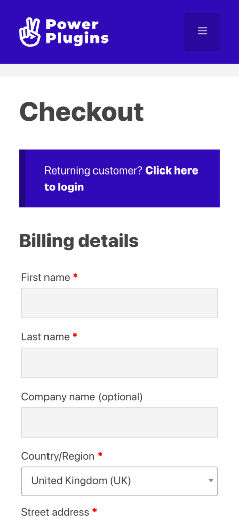
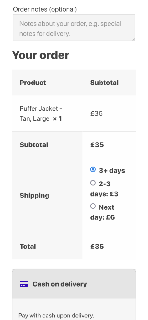
If we take the basic WooCommerce checkout, we’ll see…
- The “Click here to login” is split over two lines – not a big deal, but it’s untidy
- Company Name is not needed for our consumer clothing store
- The shipping methods radio-buttons look untidy (n my opinion)
- We’ve got to scroll down a long way to get to the Place Order button
Clean up the customer address fields
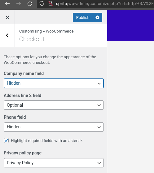
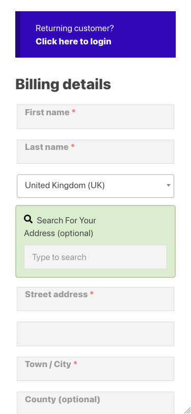
Start by using the Customiser to remove the “Company name” field. You can also remove the Phone Number field if you don’t need to capture it, although it can be useful if you need to send goods by courier.
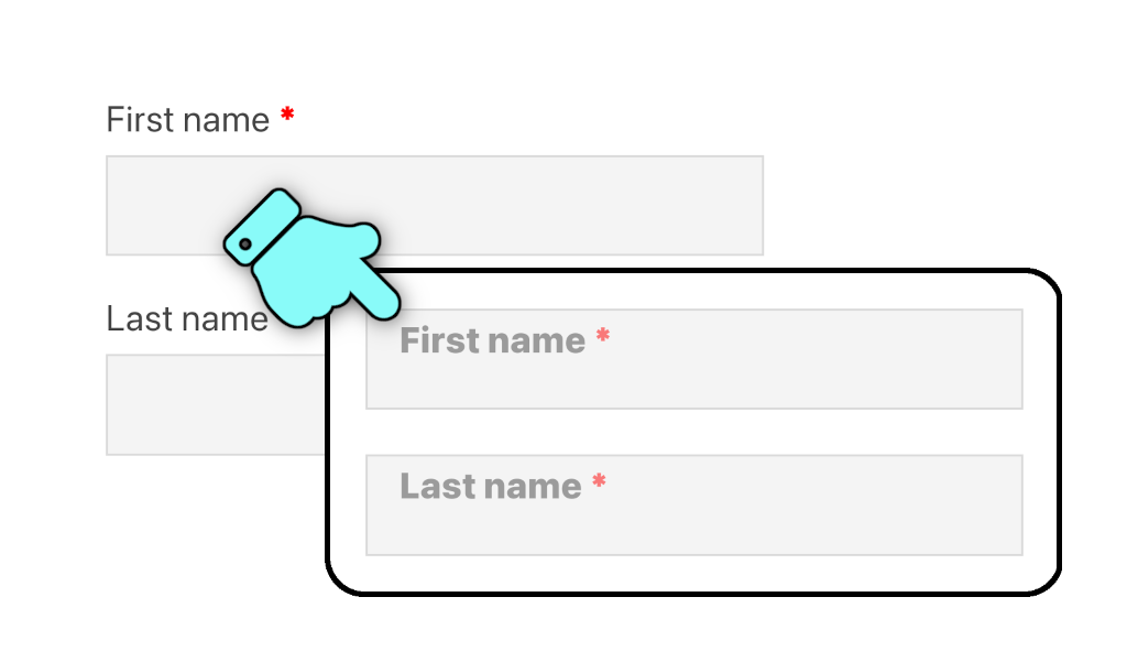
Then we’ll use a tutorial to move the checkout field labels to inside the fields, making better use of the screen real estate. Don’t let the code put you off – it’s just copy-and-paste.
A CSS snippet in the Customiser’s Additional CSS section will fix the “Click here to login” issue:
/**
 * Show the "Click here to login" prompt on its own new-line
 */
div.woocommerce-info a.showlogin {
	display: block;
}
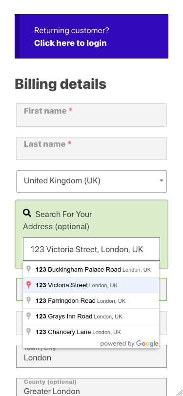
Another key UX enhancement is to add billing address auto-complete. The plugin just needs to be activated and configured with a free Google API Key. The result is an above-the-fold checkout that looks like this on mobile. Much cleaner…
Clean up the order review and shipping methods
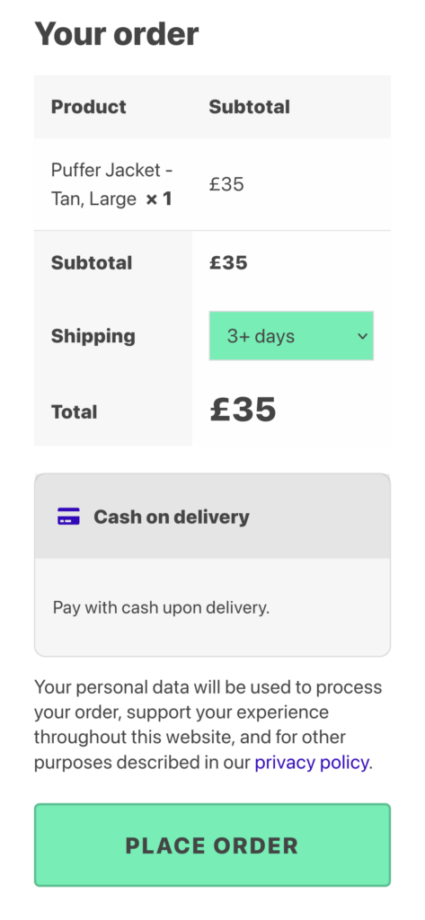
We’ll user another free tutorial to convert the shipping methods to a drop-down list. Then we can apply a bit of style to make it stand out as a call-to-action for the customer. While we’re adding CSS snippets, let’s make the amount payable stand out by increasing its font size, and tidy up a couple of other bits too.
/**
 * Fancy shipping methods
 */
.wpt-shipping-methods {
	background-color: #78edb6;
}

/**
 * Make the total amount due stand out
 */
.order-total .amount {
	font-size: 30px;
}

/**
 * Reduce the amount of space the privacy policy text takes up
 */
.woocommerce-privacy-policy-text p {
	line-height: 1.3em;
}

/**
 * Reduce the padding in the review-order table
 */
body .woocommerce table.woocommerce-checkout-review-order-table td,
body .woocommerce table.woocommerce-checkout-review-order-table th {
	padding: 15px;
}
The 5-point checkout checklist
- Remove unnecessary input fields
- Tidy up the input field labels (as placeholders)
- Enable billing address auto-complete
- Tidy up the shipping method chooser
- Add simple CSS mods to ensure the order-review table and Place Order button stand out clearly
That’s it… a few tweaks, a couple of lightweight plugins, some mobile-device testing and your checkout experience will shine 😎 👍

